Metric Explanations (Top of the Dashboard)
- Total count
- Positives
- Hit Rate
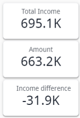
- Income
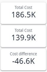
- Cost
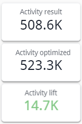
- Result
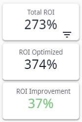
- ROI
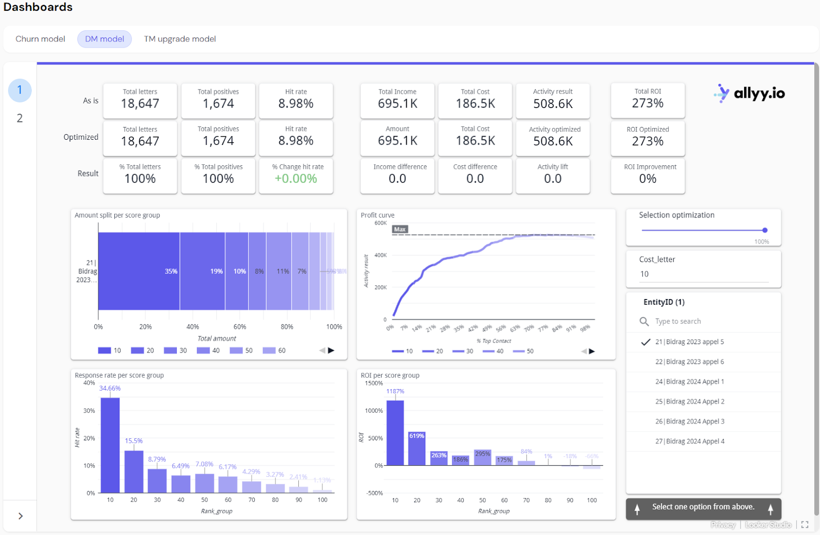
Total count (As is, Optimized, & Result)
- As is: The number of letters sent in the current campaign without any optimization, representing the full audience contacted.
- Optimized: The number of letters sent after applying optimization, typically fewer as it focuses on a more targeted audience.
- Result (%): The percentage of letters sent compared to the original (As is). For example, if you send 12,307 letters instead of 18,647, the result would be 66%.
Graph Explanations
- Amount Split
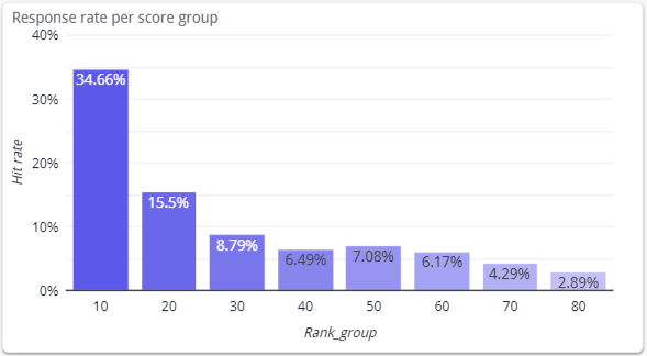
- Response Rate
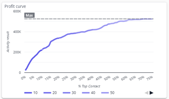
- Profit curve
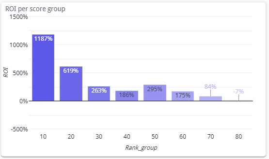
- ROI
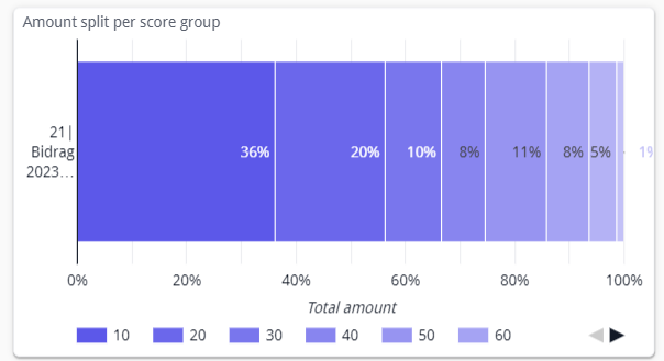
Amount Split per Score Group
- Graph Explanation: This bar chart shows the distribution of letters sent across different score groups, which rank contacts based on their likelihood to respond. Each score group represents a percentage of the total letters sent and the amount generated.
- Interactive Action: Users can use this graph to visualize how many letters were sent to each score group and adjust their targeting strategy accordingly. The optimized version typically sends more letters to higher-ranked groups.
Interactive Element Explanations
- Selection Optimization Slider
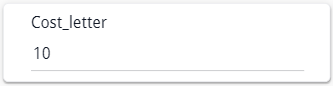
- Cost per Letter Input
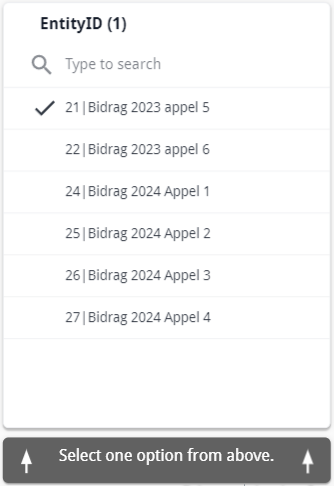
- EntityID Selection
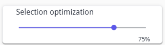
Selection Optimization Slider
- Explanation: This slider allows users to adjust the percentage of letters sent to optimize the campaign. Moving the slider dynamically updates the metrics and graphs on the dashboard, showing the impact of optimization. A slider on 75% will mean that we are only seeing data for the best 75% of the scores.
- Interactive Action: By sliding the bar, users can see how reducing or increasing the number of letters impacts the total cost, hit rate, income, and ROI.
Key Takeaways from the dashboard
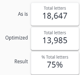
- Optimized Targeting: The optimized approach significantly reduces the number of letters sent while maintaining a high number of positive responses. This indicates that the optimization successfully targets the most responsive contacts, leading to better results with fewer resources.
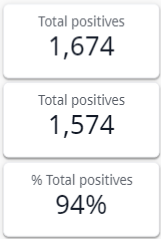
- Hit Rate Improvement: The hit rate increases in the optimized scenario, showing that even with fewer letters sent, the likelihood of positive responses increases due to better audience targeting. The optimized hit rate shows a substantial improvement, meaning the campaign is more effective.
- Cost Reduction: A major advantage of the optimization process is the sharp reduction in total campaign costs. By sending fewer letters to the right contacts, the total cost decreases significantly, improving the overall financial efficiency of the campaign.
- Slight Decrease in Income, but Increased ROI: While the total income may slightly decrease due to sending fewer letters, this is offset by the much lower costs. The result is a higher return on investment (ROI), meaning the campaign becomes more profitable