This dashboard presents performance metrics for campaigns, analyzing responses and contact behavior over historical periods. It provides insights into how contacts react to multiple campaigns, helping optimize the frequency and targeting of future campaigns.Documentation Index
Fetch the complete documentation index at: https://docs.allyy.io/llms.txt
Use this file to discover all available pages before exploring further.

Metric Explanations (Top of the Dashboard):
- Total Contacts
- Positive Contacts
- No Response Contacts
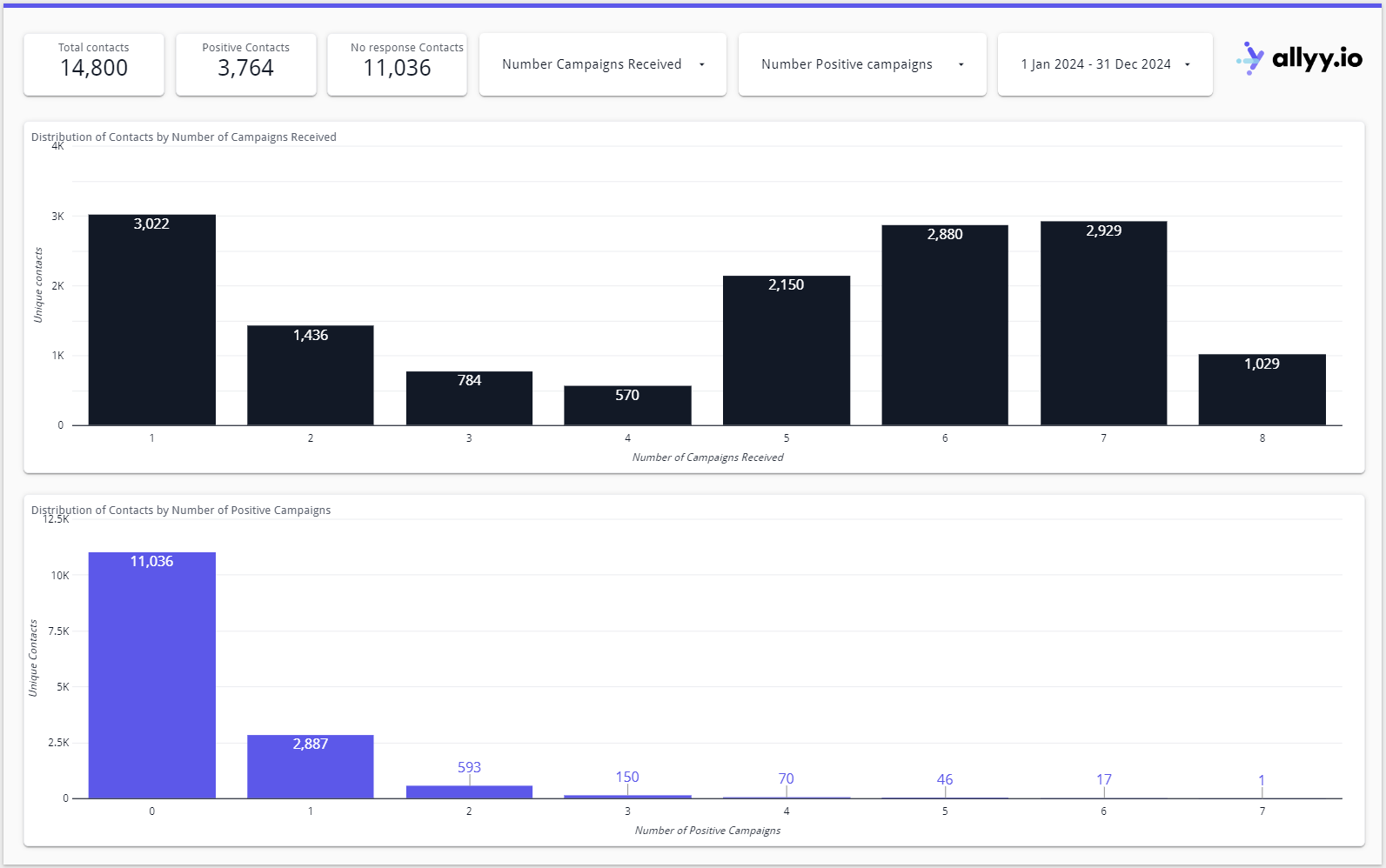
Total Contacts
- Explanation: This metric represents the total number of unique contacts who received one or more direct mail (DM) campaigns during the selected time period.
- Current Example: The total number of contacts who received any number of DM campaigns is 14,800.


Graph Explanations:
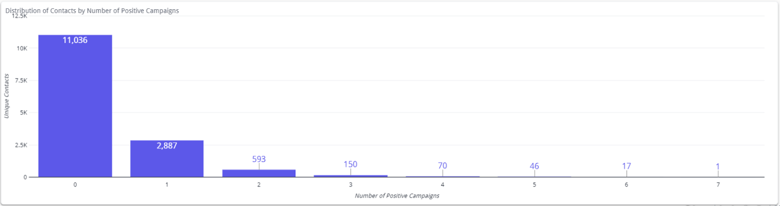
- Contact distribution by campaigns
- Contact distribution by positive campaigns
Distribution of Contacts by Number of Campaigns Received
- Graph Explanation: This bar chart shows how many unique contacts received a specific number of campaigns. Each bar represents the number of people who received 1, 2, 3, or more direct mail campaigns.
- Current Example: 3,022 contacts received 1 campaign, 1,436 received 2 campaigns, and so on, with a clear distribution of contacts based on the number of campaigns they received.
- Interactive Action: Users can click on a specific bar (e.g., contacts who received 5 campaigns), and the rest of the dashboard updates to show how these people responded in terms of positive actions or donations.

Interactive Features Explanation:
- Selection of Campaigns
- Time Period Selection
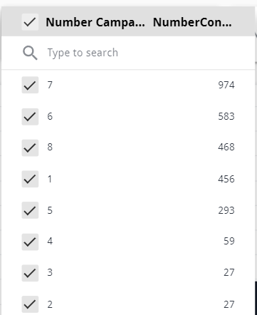
Selection of Number of Campaigns or Positive Campaigns
- Explanation: Users can select a specific number of campaigns or positive campaigns using the dropdowns or by clicking on the bars in the chart. The dashboard will update to display detailed information about the selected group.
- Interactive Action: For example, if you select only contacts who received 5 campaigns, the dashboard will display details specific to this group, such as their positive response rate or how many campaigns they engaged with.

Key Takeaways:
- Reduce Over-Mailing: The dashboard highlights that many people receive multiple campaigns per year, but only a small percentage respond positively. This suggests that there is room to optimize by reducing the number of mailings to individuals, particularly for those who are predicted to donate only once.
- Targeted Campaign Frequency: For individuals who are predicted to donate only once per year, sending multiple (e.g., 5, 6, or 7) campaigns may not increase their likelihood of donating more. Reducing the number of campaigns for these individuals could improve campaign efficiency and reduce donor fatigue.
- Efficient Resource Allocation: By analyzing how many campaigns result in positive responses, the business can better allocate its resources. This helps in cutting costs related to printing and mailing while maintaining strong donation outcomes.
- Prevent Donor Fatigue: Repeated mailings to the same individuals, especially those unlikely to respond multiple times, can lead to donor fatigue, where recipients become less likely to engage over time. Reducing the frequency of campaigns for individuals with low predicted donation rates ensures that communication remains relevant and well-received.
- Data-Driven Decision Making: The dashboard’s insights enable businesses to take a more data-driven approach to campaign planning. By identifying groups that respond after fewer campaigns, users can streamline their communication strategy, focusing on delivering the right message at the right time, rather than overloading contacts with too many campaigns.