This dashboard presents performance metrics for historical churn periods, integrating model scores and actual results from past periods. It provides insights into how the model’s predictions align with real outcomes, helping to evaluate and optimize future periods.Documentation Index
Fetch the complete documentation index at: https://docs.allyy.io/llms.txt
Use this file to discover all available pages before exploring further.

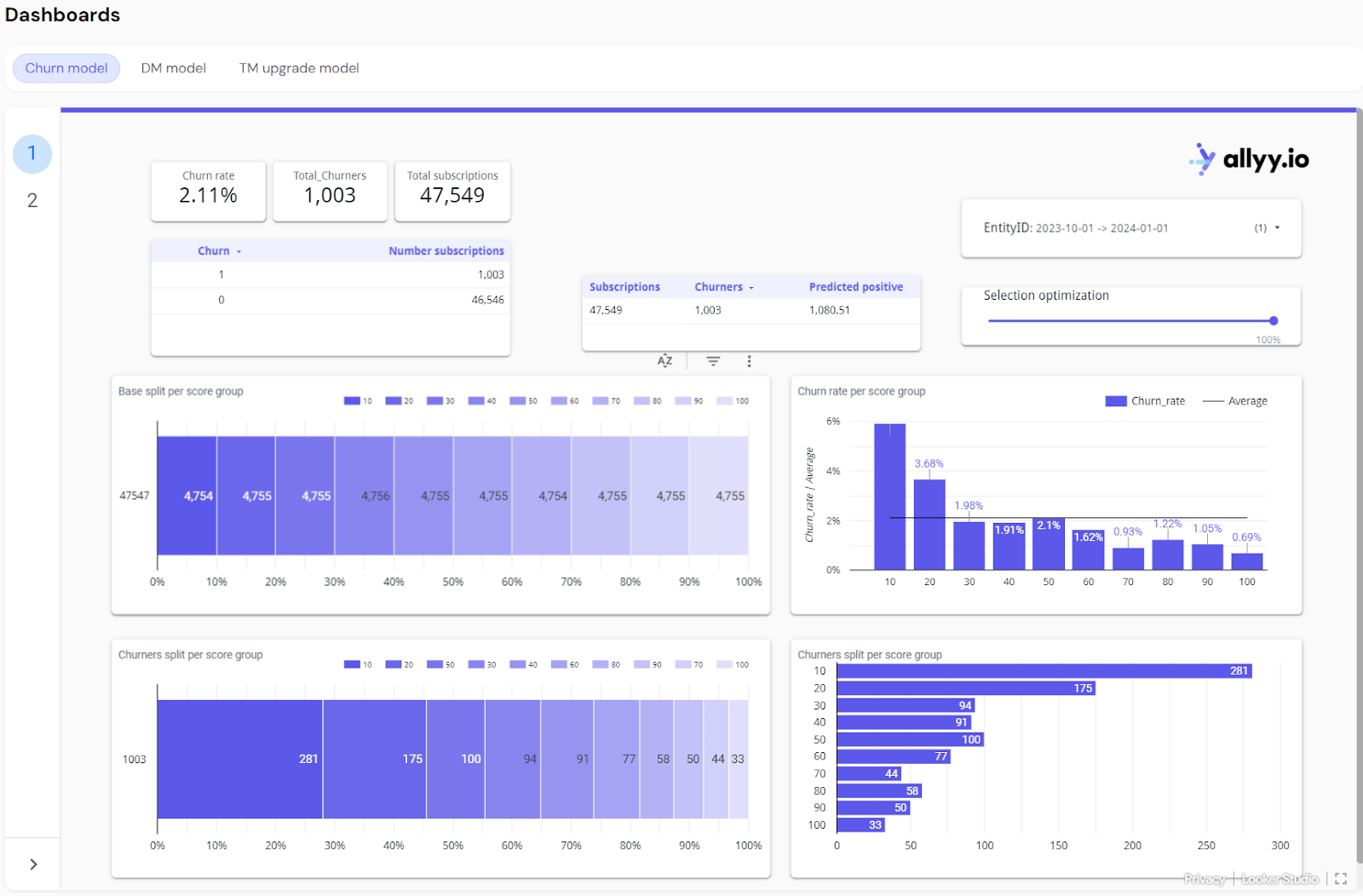
Metric Explanations (Top of the Dashboard):
- Churn Rate
- Total Churners
- Total Subscriptions
- Predicted Positives
Churn Rate
- Explanation: The churn rate represents the percentage of total subscribers who have left (churned) during the selected period.
- Current Example: In this case, the churn rate is 2.11%, meaning 2.11% of the total subscribers have churned during the selected time frame.
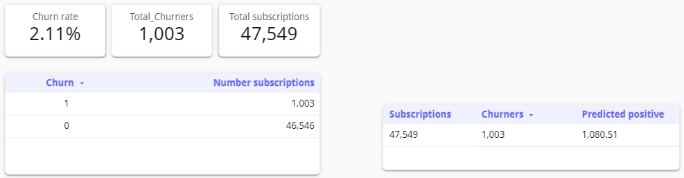
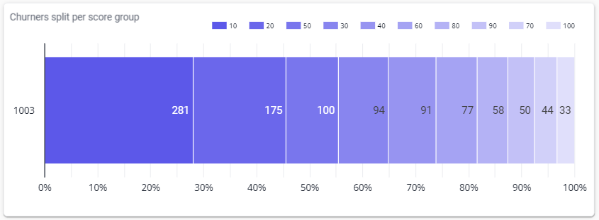
Graph Explanations:
- Base Split
- Churners Split
- Churn Rate
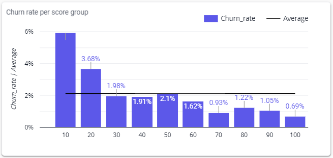
Base Split per Score Group
- Graph Explanation: This bar chart shows how the total subscription base is distributed across different score groups. Score groups rank subscribers based on their likelihood to churn, with each bar representing the number of subscribers in that group.
- Current Example: Each group contains around 4,754 to 4,756 subscribers, showing an even distribution of the total subscription base across score groups.
Interactive Features Explanations:
- EntityID Selection
- Selection Optimization Slider
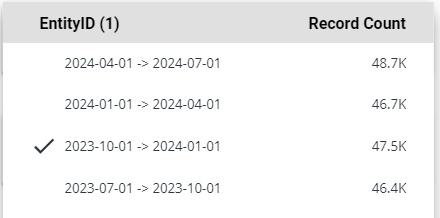
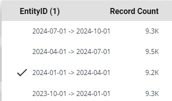
EntityID Selection (Time Period)
- Explanation: The EntityID selection dropdown allows users to select a specific time period for analysis. Once selected, the dashboard updates to show churn data for that particular period.
- Interactive Action: Users can select a different time period (e.g., Q4 2023, Q1 2024) to view churn rates, total churners, and other metrics for that specific period. The Record Count column shows the total number of subscriptions for each period, allowing for comparisons across time periods.
Key Takeaways:
- Churn Distribution Across Score Groups: The dashboard provides a clear visualization of how churn is distributed across different score groups, helping users identify which segments of the customer base are more likely to churn.
- Score Group Insights: By analyzing the churn rate per score group, users can easily spot the most vulnerable groups (e.g., the top 10% most likely to churn) and prioritize actions or campaigns to retain these customers.
- Time Period Comparison: Users can select different time periods using the EntityID Selection feature and compare churn rates and total churners across various time frames, enabling better planning and decision-making for future retention strategies.
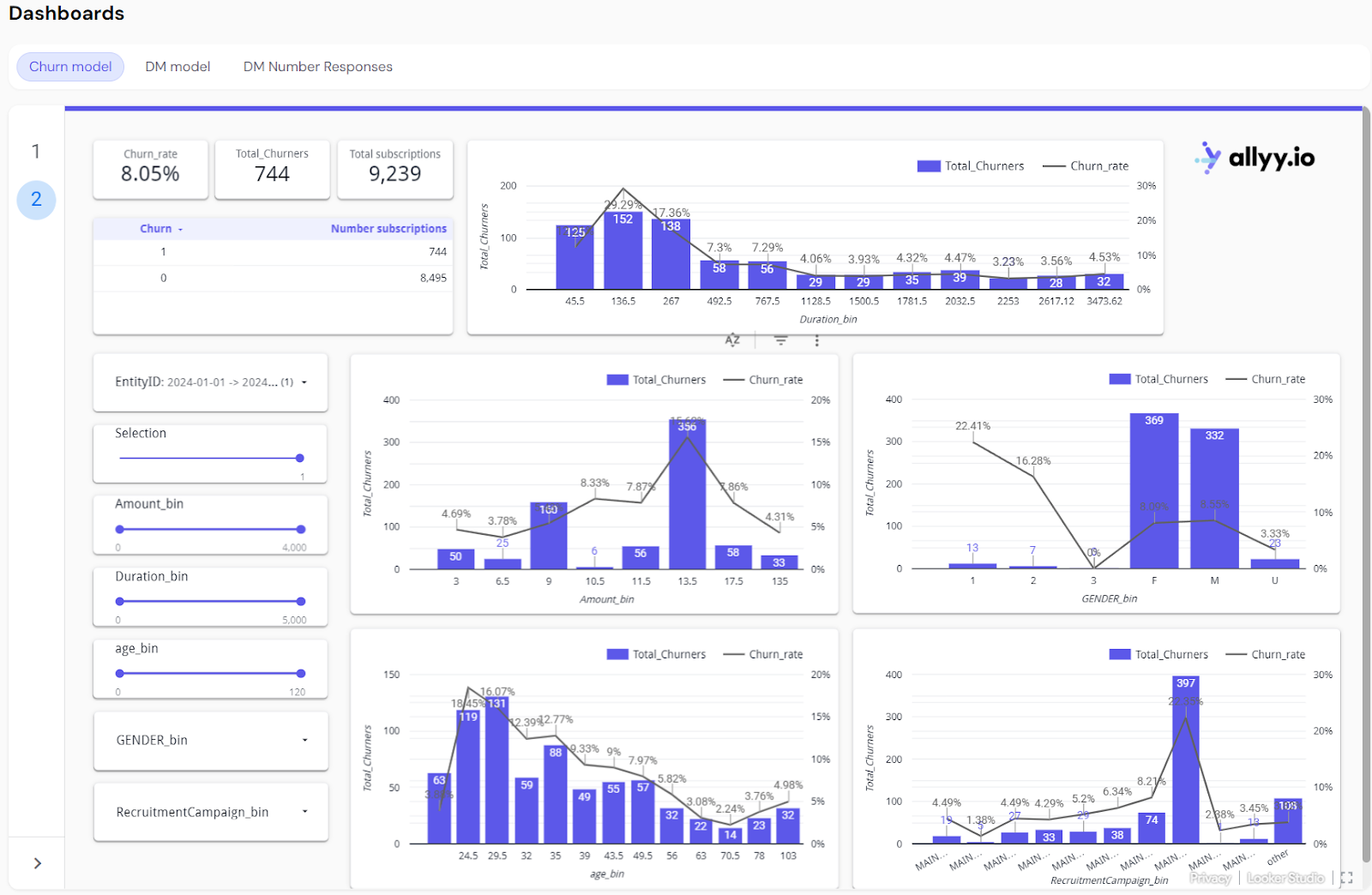
Churn model second tab: Churn characteristics
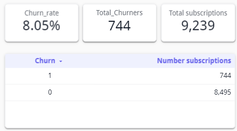
Metric Explanations (Top of the Dashboard):
- Churn Rate
- Total Churners
- Total Subscriptions
Churn Rate
- Explanation: The churn rate represents the percentage of total customers or subscribers who have left (churned) during the selected period. It is a key indicator of customer retention performance.
Graph Explanations (Applies to All Types of Data):
- Total Churners vs. Churn Rate
- Amount Bins
- Duration Bins
- Demographic Bins
- Campaign Bins
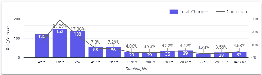
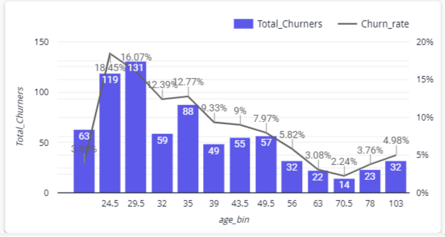
Total Churners vs. Churn Rate Graphs
- Explanation: These bar charts show two key metrics:
- Total Churners (displayed as bars): The number of churners for a specific group or bin, representing how many customers churned from each group.
- Churn Rate (displayed as a line): The percentage of customers who churned relative to the total number in that group or bin.
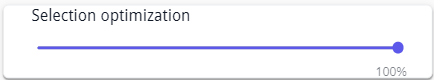
Interactive Sliders Explanation (Generic):
- Selection Slider
- Attribute Bins
- Flexible Bin Names
- EntityID Selection
Selection Slider
- Explanation: This slider lets users adjust the selection of data included in the analysis. By narrowing or expanding the selection, users can focus on different segments of the customer base and see how churn is affected.

Key Takeaways:
- Customizable Insights: This tab allows users to customize their churn analysis based on available data attributes, making it versatile across different types of businesses. Whether focusing on demographics, subscription levels, or campaign performance, users can easily adjust the dashboard to suit their specific needs.
- Targeted Retention Strategies: By visualizing churn data across different segments of the customer base, users can identify at-risk groups and tailor retention strategies accordingly. The dashboard provides flexibility in exploring various customer attributes, helping businesses focus their efforts where churn is highest.
- Time-Based Comparisons: With the ability to select different time periods, users can track how churn trends change over time. This enables better planning and understanding of customer behavior, seasonality, and the impact of retention efforts across multiple periods.