Classification models (DM Propensity as an example)
Dashboards in the Business Case Section
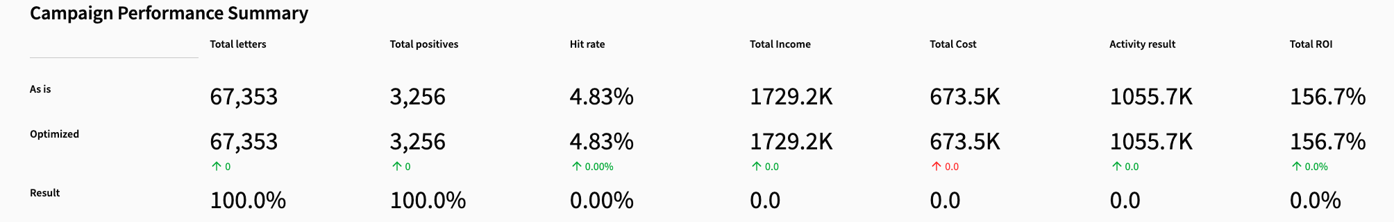
Each dashboard shows a different aspect of model performance on the holdout data. Together, they help users understand both operational performance and financial outcomes.Campaign Performance Summary
- Campaign Performance Summary
What Each Metric Means
Total letters - The number of individuals who would have been contacted. Total positives - The number of donors captured (true positives). Hit rate - Donors captured divided by letters sent. Total income - Revenue generated from donors in the holdout period. Total cost - Cost of sending letters, based on the user-defined cost per letter. Activity result - Net revenue (income minus cost). Total ROI - Return on investment, calculated as net revenue divided by cost.Score Distribution by Actual Outcome
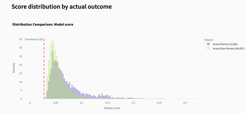
- Score Distribution by Actual Outcome
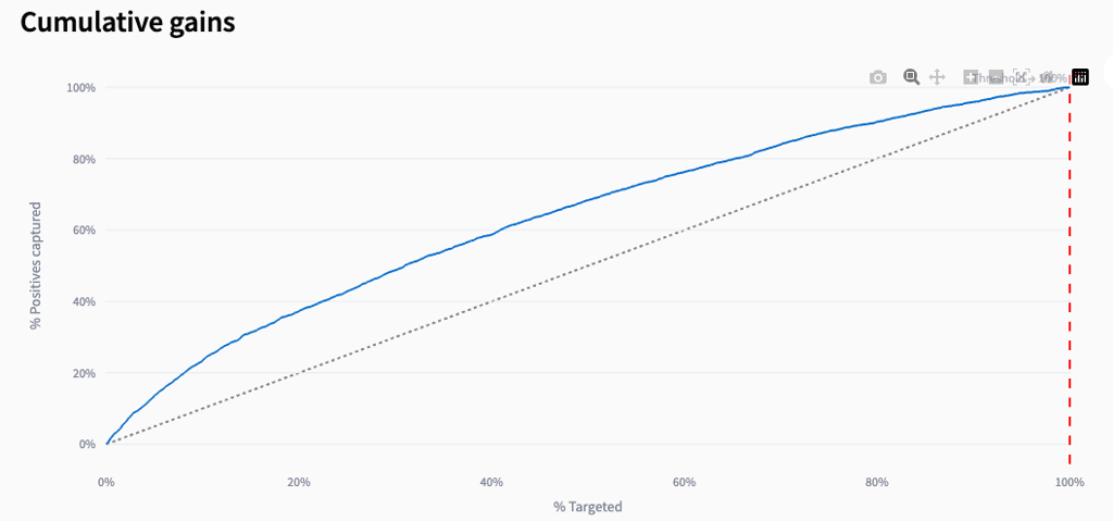
Cumulative Gains
- Cumulative Gains
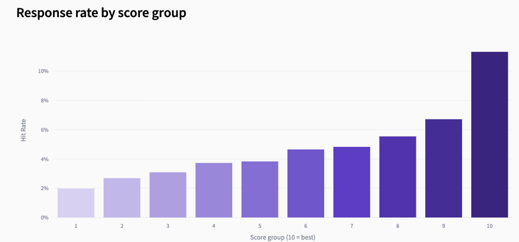
Response rate by score group
- Response Rate by Score Group
What this chart tells the user
Higher score groups respond more often The clear upward trend means the model is correctly ranking individuals: those with higher scores are more likely to donate. Score group separation The difference between low and high groups shows how strong the model’s predictive power is. Low groups (1–3) have low response rates. High groups (8–10) have much higher response rates. Targeting quality This chart helps determine where the cutoff should be. Groups with very low response rates may not be worth contacting. Groups with high response rates are the most profitable to target. Model precision A smooth, increasing pattern indicates a well-calibrated model. If the bars were flat or random, the model would not be ranking donors effectively.Profit curve
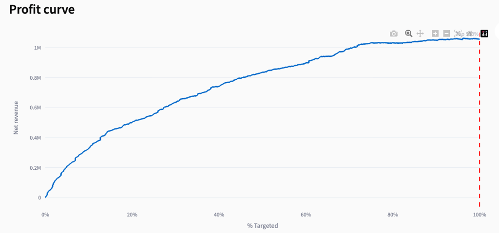
- Profit Curve
What this chart tells the user
Revenue growth pattern The curve shows how net revenue increases as targeting expands. A steep rise early in the curve indicates that the highest-scoring individuals generate the most value. Diminishing returns As the curve flattens, each additional percentage of the population contributes less revenue. This is where low-scoring groups begin to dilute profitability. Optimal targeting point The highest point on the curve represents the most profitable targeting percentage. Targeting beyond this point increases cost more than revenue. Current strategy vs. optimal The red dashed line shows the current targeting level. If it is left of the peak, the organization is under-targeting; if it is right of the peak, it is over-targeting.Amount split by score group
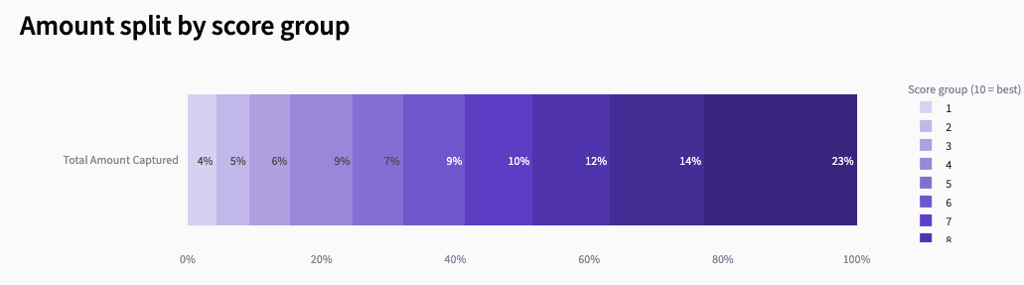
- Amount Split by Score Group
What this chart tells the user
Higher score groups generate more revenue The rightmost groups (8–10) contribute the largest share of total income. This confirms that the model is correctly ranking individuals: those predicted to be more likely to respond also tend to donate more. Lower score groups contribute very little Groups 1–3 contribute only a small fraction of total revenue. These groups are typically unprofitable to target and may be excluded in optimized scenarios. Score-to-value alignment The smooth increase from low to high score groups indicates that the model’s scoring aligns well with actual donor value. This is a key indicator of model quality. Targeting strategy implications Because most revenue comes from the top score groups, focusing mailings on these groups can significantly improve ROI and reduce cost.ROI by Score group
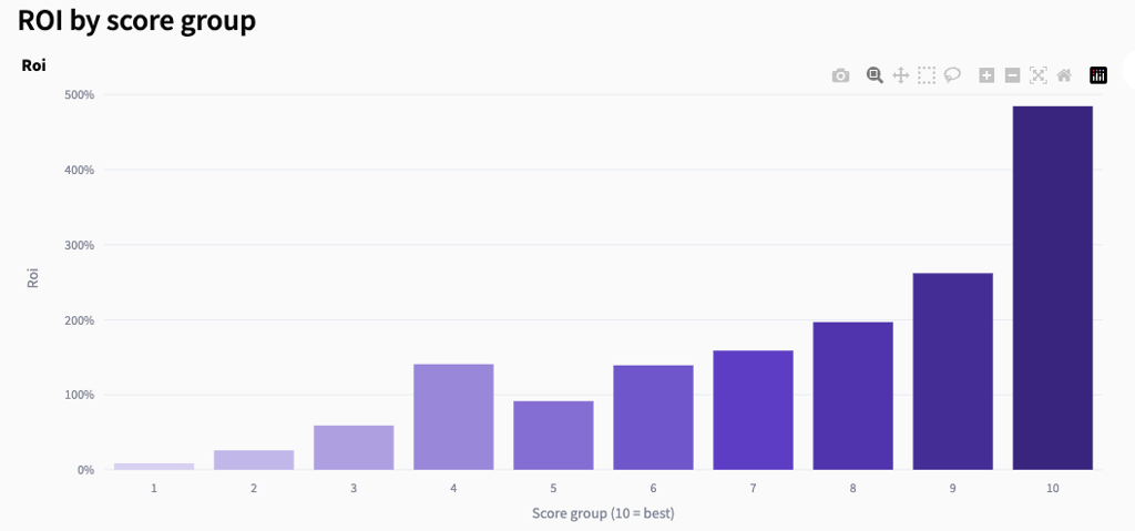
- ROI by Score Group
What this chart shows
Higher score groups deliver much higher ROI ROI rises steadily from group 1 to group 10, with the top group generating the strongest financial return. This indicates that the model is correctly ranking individuals not only by likelihood to respond but also by profitability. Lower score groups are often unprofitable The lowest groups (1–3) typically show very low ROI. These groups tend to cost more to contact than they return in revenue. Strong score-to-ROI alignment The smooth upward trend confirms that the model’s scoring correlates well with actual financial outcomes. This is a key indicator of a high-quality predictive model. Clear targeting implications Because ROI increases sharply in the higher groups, focusing mailings on groups 7–10 can significantly improve campaign profitability.Campaign Performance Overview
- Campaign Performance Overview
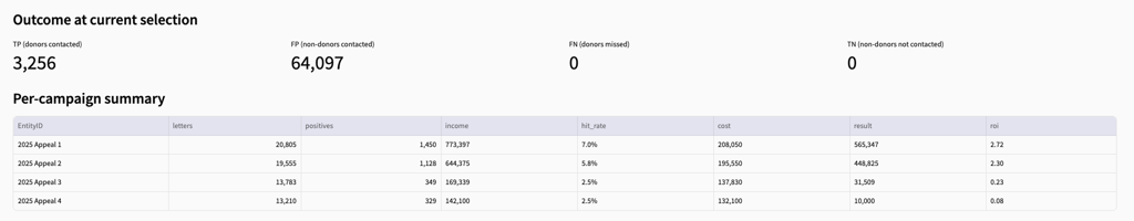
Outcome at current selection
TP (donors contacted) — donors the model correctly identified and would have mailed. FP (non-donors contacted) — people contacted who did not donate. FN (donors missed) — donors the model failed to identify. TN (non-donors not contacted) — non-donors correctly excluded.Per-campaign summary
letters — number of people contacted. positives — donors captured in that campaign. income — revenue generated from those donors. hit_rate — donors divided by letters sent. cost — mailing cost based on the user-defined cost per letter. result — net revenue (income minus cost). roi — return on investment for that campaign.Campaign-level performance dashboard
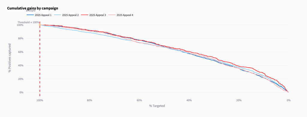
Cumulative gains by campaign
- Cumulative Gains by Campaign
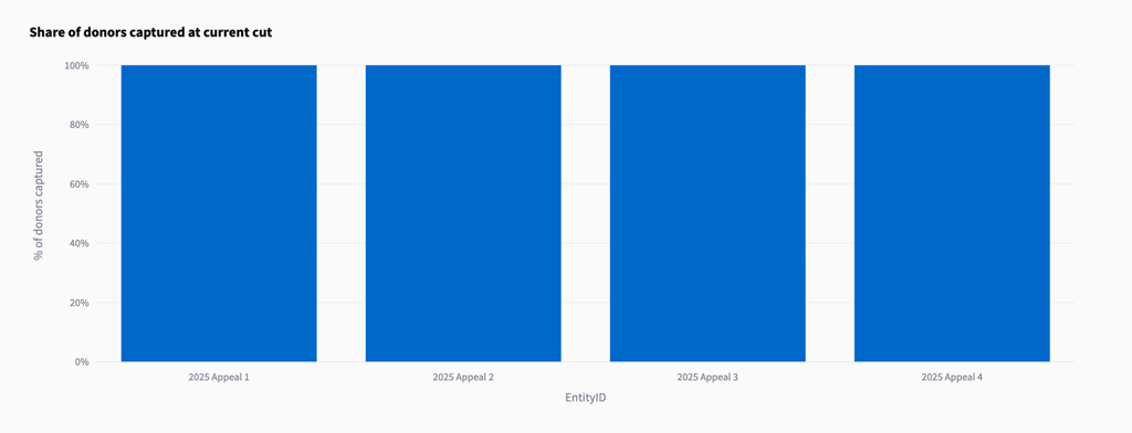
Share of donors captured at current cut
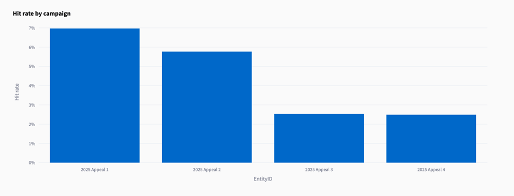
Hit rate by campaign
- Hit Rate by Campaign
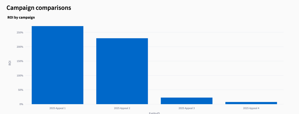
ROI by campaign
- ROI by Campaign