Regression models (DM Expected Amount as an example)
Prediction Accuracy Summary
- Prediction Accuracy Summary
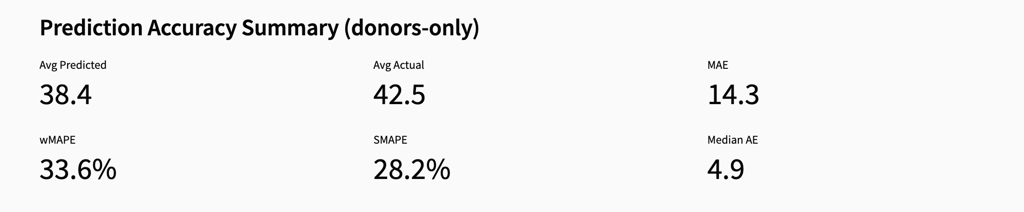
What Each Metric Means
avg_pred - The average predicted donation amount for the campaign. avg_actual - The average actual donation amount observed in the holdout period. MAE - The average absolute difference between predicted and actual amounts. Lower values indicate more accurate predictions. wMAPE - The average percentage error weighted by actual values. This reflects how large the prediction errors are relative to true donation amounts. sMAPE - A symmetric percentage error metric that balances over- and under-predictions.What this table tells the user
Prediction accuracy by campaign Differences between avg_pred and avg_actual show whether the model tends to over- or under-estimate revenue for specific campaigns. Error variability Higher MAE or percentage errors indicate campaigns where predictions are less reliable. Campaign-level performance This view helps identify which campaigns are well modeled and which may require further tuning or segmentation.Amount Share by Score Group
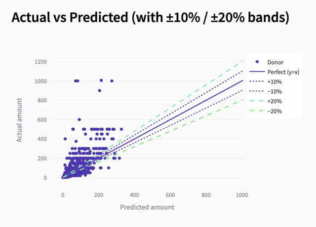
What this chart tells the user
Prediction accuracy Points close to the diagonal line indicate accurate predictions, where the model correctly estimates donation amounts. Error distribution The spread of points around the line shows how much predictions deviate from actual values across different donation levels. Tolerance bands Points within the ±10% and ±20% bands represent acceptable levels of prediction error, helping users assess how often the model meets accuracy expectations. Outliers and extreme errors Points far from the diagonal highlight cases where the model significantly over- or under-predicts donation amounts. Model behavior at different values Larger deviations often appear at higher predicted amounts, indicating that high-value donations are harder to estimate precisely.Calibration by Score Group (10 = highest predicted)
- Calibration by Score Group
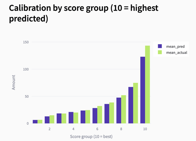
What this chart tells the user
Calibration quality. When predicted and actual values are close, the model is well calibrated. Systematic bias. If predicted values are consistently below or above actual values, the model is under- or over-estimating donation amounts. Consistency across groups. A smooth and aligned pattern indicates stable model behavior across segments. Model reliability. Good calibration is critical for making accurate revenue forecasts and planning campaigns.Absolute Error by Score Group
- Absolute Error by Score Group
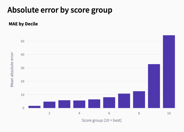
What this chart tells the user
Error increases with value Higher score groups tend to have larger errors because higher donation amounts are more variable and harder to predict. Stable low-value predictions Lower score groups typically show smaller errors. Risk in top segments While high-score groups drive most revenue, they also carry higher uncertainty.Amount Share by Score Group
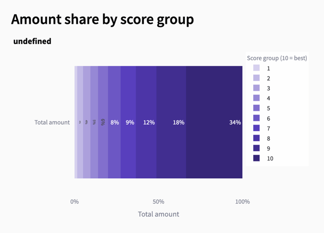
What this chart tells the user
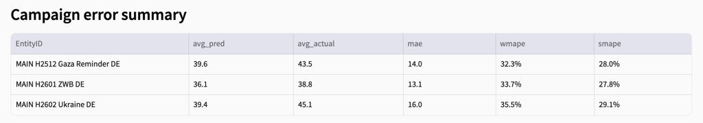
Higher score groups generate most of the revenue The largest share of total amount comes from the highest score groups, confirming that the model correctly identifies high-value donors. Lower score groups contribute little Low-scoring groups account for a small fraction of total revenue and are often less important for targeting. Score-to-value alignment A clear increase from low to high groups indicates that the model’s ranking aligns well with actual donation amounts. Targeting implications Focusing on the top score groups can significantly improve efficiency and maximize revenue.Campaign Error Summary
- Campaign Error Summary