

Global Feature Importance
- Global Feature Importance
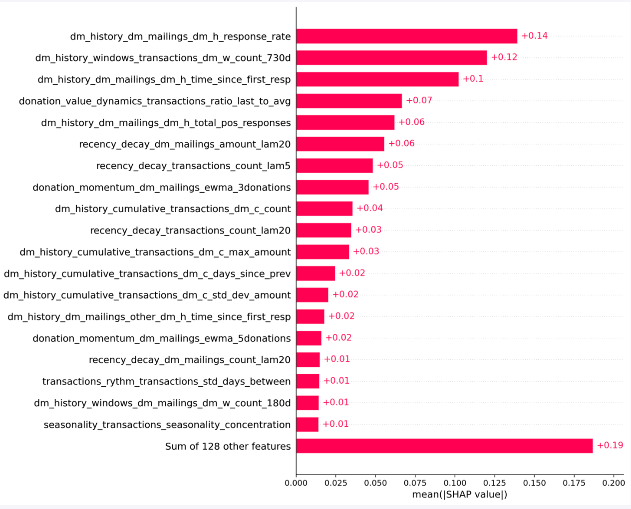
What this chart tells the user
- Primary Drivers: The top-ranked features represent the most critical data points for the model. For instance, age can act as an intuitive anchor for decision-making because many users understand how life stage may influence response likelihood.
- Interpretation by Business Case:
- In Classification (e.g., DM Propensity): A long bar means this feature heavily dictates whether a user’s probability of responding shifts up or down.
- In Regression (e.g., DM Expected Amount): A long bar means this feature heavily dictates the predicted donation amount assigned to a donor.
- The Long Tail of Data: The “Sum of 128 other features” at the bottom highlights that while individual secondary features may each have a smaller impact, their combined contribution can still be meaningful. For example, a model may have no additional named features beyond the top drivers, in which case there is no long-tail contribution; in other cases, many small features together can add a high cumulative impact and materially refine the prediction.
Feature Impact and Directional Behavior (Beeswarm)
- Feature Impact and Directional Behavior (Beeswarm)
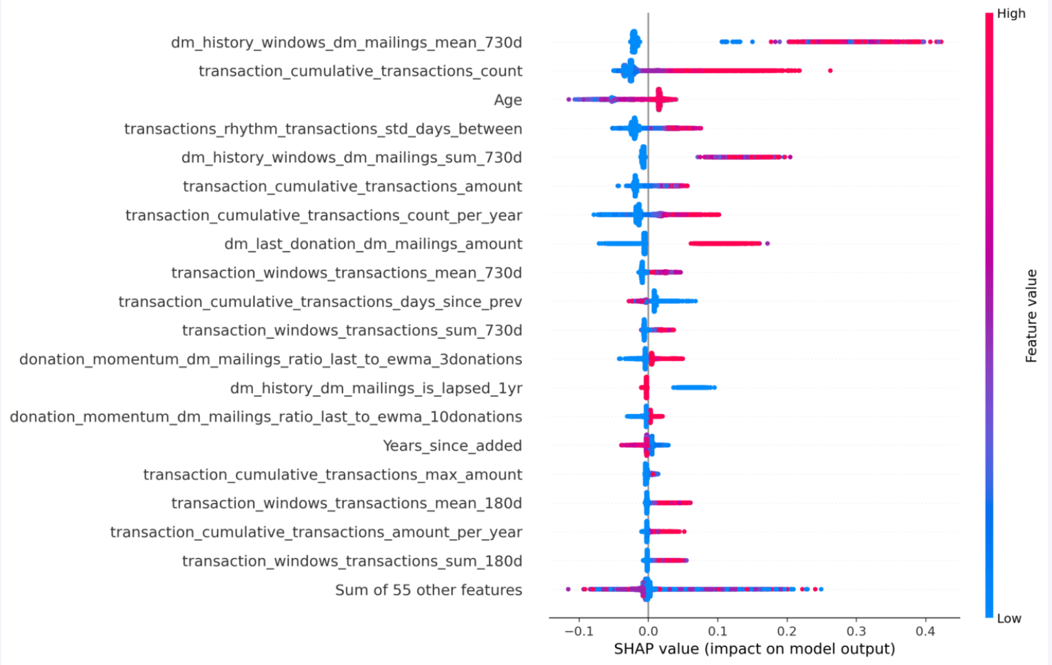
- Vertical Position: Groups the dots by feature (ordered from most important at the top to least important).
- Horizontal Position (X-axis): Shows the SHAP value. Points to the right of the center line (0.0) indicate a positive impact (increasing the model score); points to the left indicate a negative impact.
- Color Scale: Represents the actual value of the feature for that individual (Red = High value, Blue = Low value).
How to read the colours and direction
- Positive Correlations (Red on the Right): For features like Age, the red cluster sits entirely on the right side.
- Classification Example: A high historical response rate (red dots) pushes the score to the right, meaning a higher probability of conversion/outreach success.
- Regression Example: A high historical response rate (red dots) pushes the score to the right, meaning the model will predict a higher donation probability for this individual.
- Negative Correlations (Red on the Left / Blue on the Right): For features where blue clusters push to the right, lower raw values provide a stronger lift to the prediction score (e.g., fewer days since the last transaction meaning higher engagement).
- Density and Outliers: The thickness of the “swarms” indicates how common a specific behavior is across the dataset, helping users spot whether a feature affects the majority of the audience or just a select few outliers.
Feature Dependence Analysis
- Feature Dependence Analysis
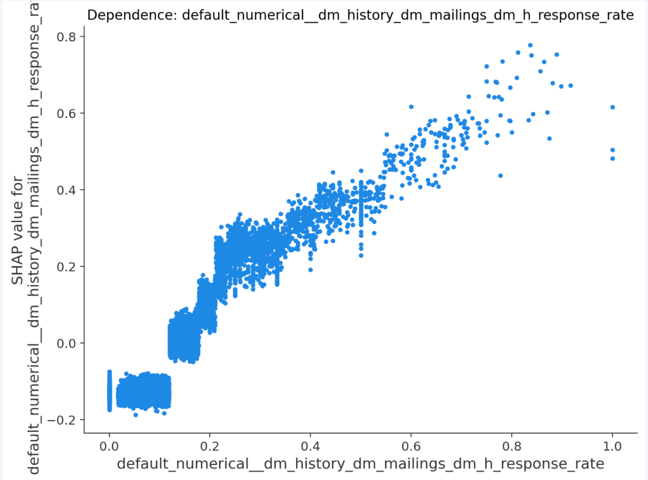
What this chart tells the user
- Clear Response Thresholds: The distinct “steps” or sudden vertical jumps in the plot (such as around the 0.12 and 0.20 marks) reveal specific inflection points where the model suddenly changes how it treats a user.
- Dual-Case Interpretation:
- Classification Context: At an x-value of 0.4, the SHAP value jumps to +0.35, adding a massive boost to the individual’s likelihood to churn or open an email.
- Regression Context: That same jump at 0.4 translates directly into a baseline increase in the expected lifetime value (LTV) calculated for that profile.
- Diminishing Returns & Saturation: Users can observe where the curve flattens out. If the SHAP value stops rising after a certain threshold on the x-axis, it indicates that increasing the feature value beyond that point yields no additional predictive lift.
Individual Prediction Breakdown (Waterfall)
- Individual Prediction Breakdown (Waterfall)
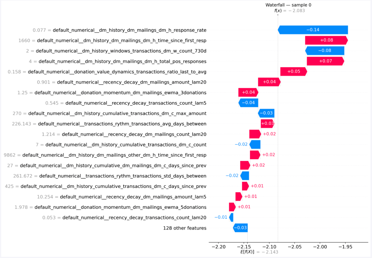
- (Baseline): The starting value at the bottom represents the average prediction score across the entire dataset before looking at this individual’s specific data.
- (Final Score): The value at the top represents this specific individual’s final predicted score.
- Colored Bars:
- Red Bars (+): Factors that increased this individual’s score above the baseline.
- Blue Bars (-): Factors that dragged this individual’s score down.
What this chart tells the user
- The Winning/Losing Attributes: It allows users to pinpoint the exact “tipping points” for an individual profile.
- Classification Application: In this sample, a low historical response rate dragged the score down by -0.14 (reducing their conversion probability), while a long time since the first response (+0.08) pulled the probability back up.
- Operational Transparency: This level of granularity is highly valuable for customer success teams or campaign managers who need to understand the precise mix of behavioral history that qualified or disqualified a specific high-value segment.